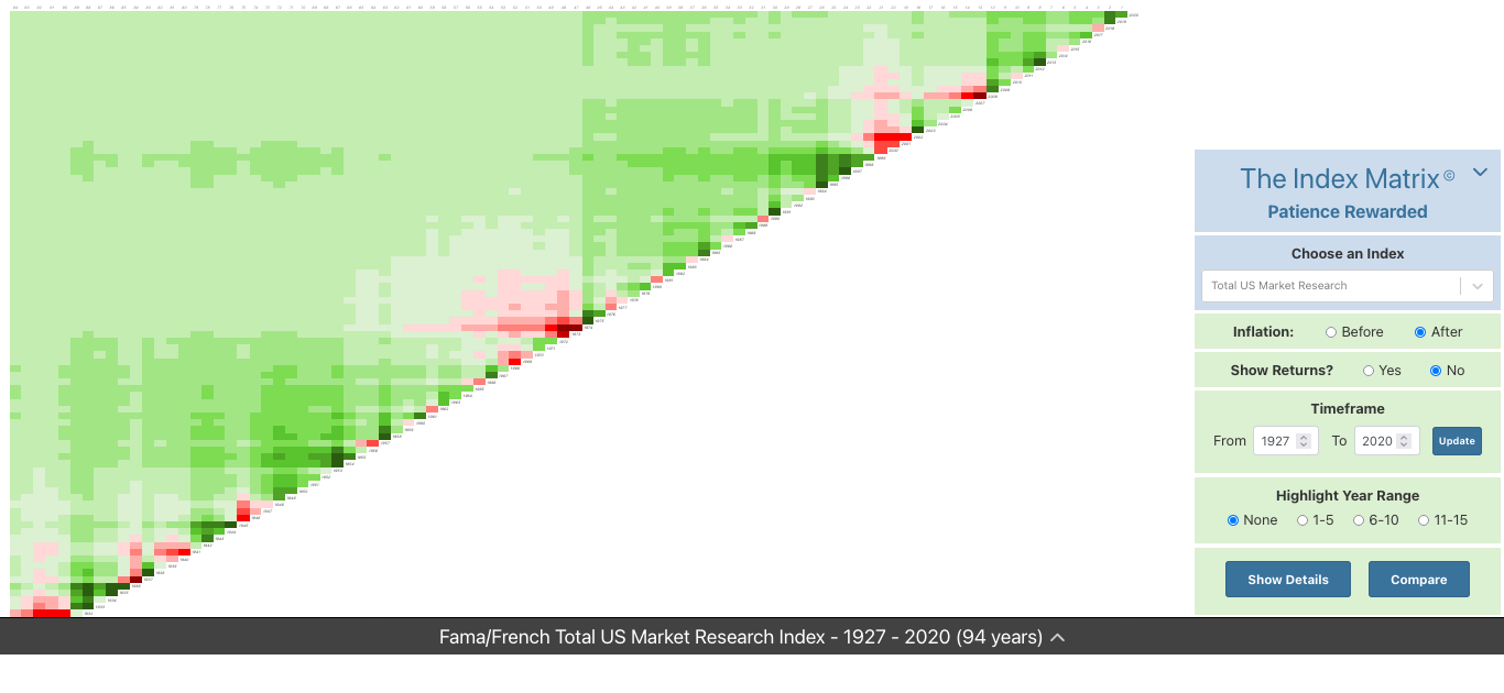
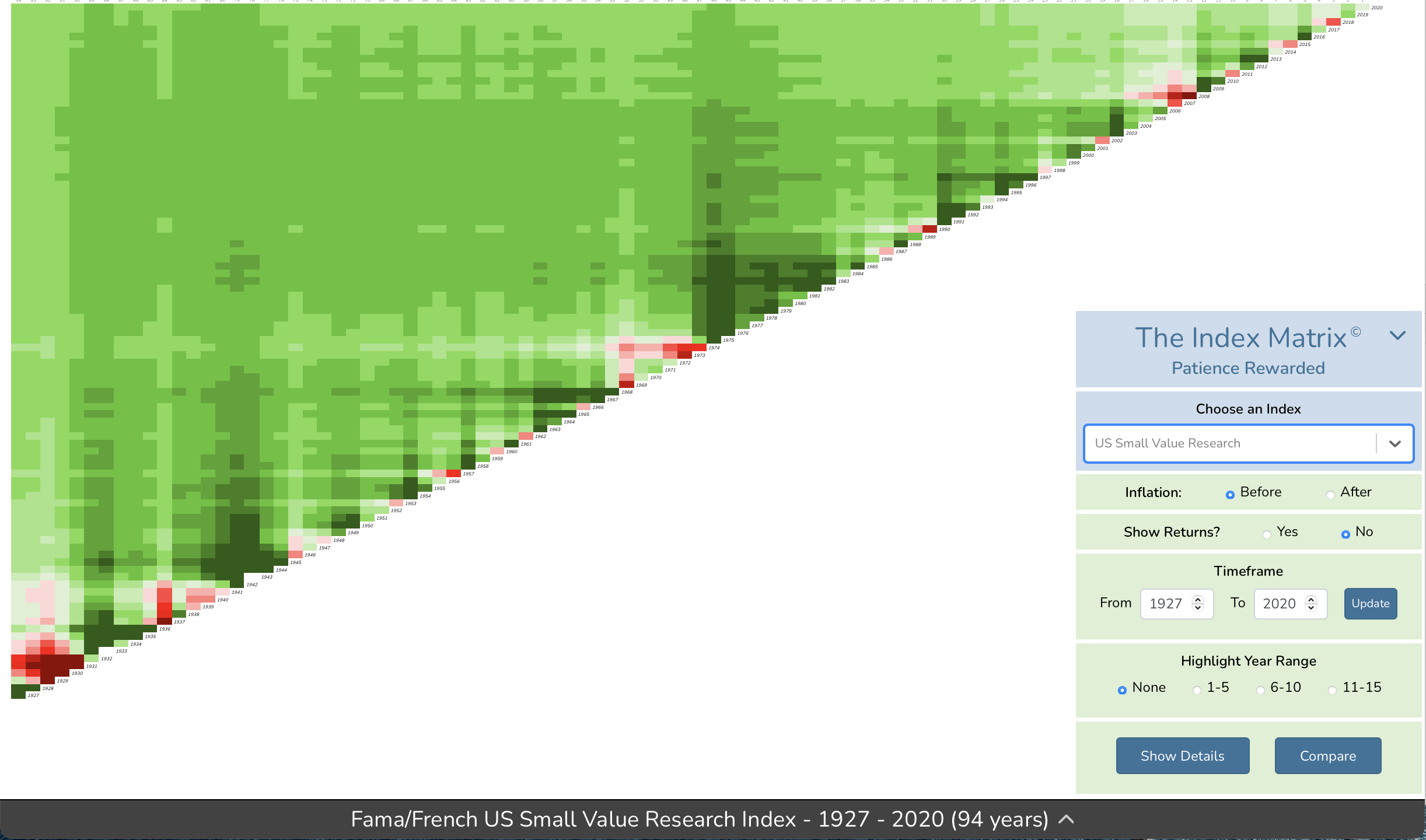
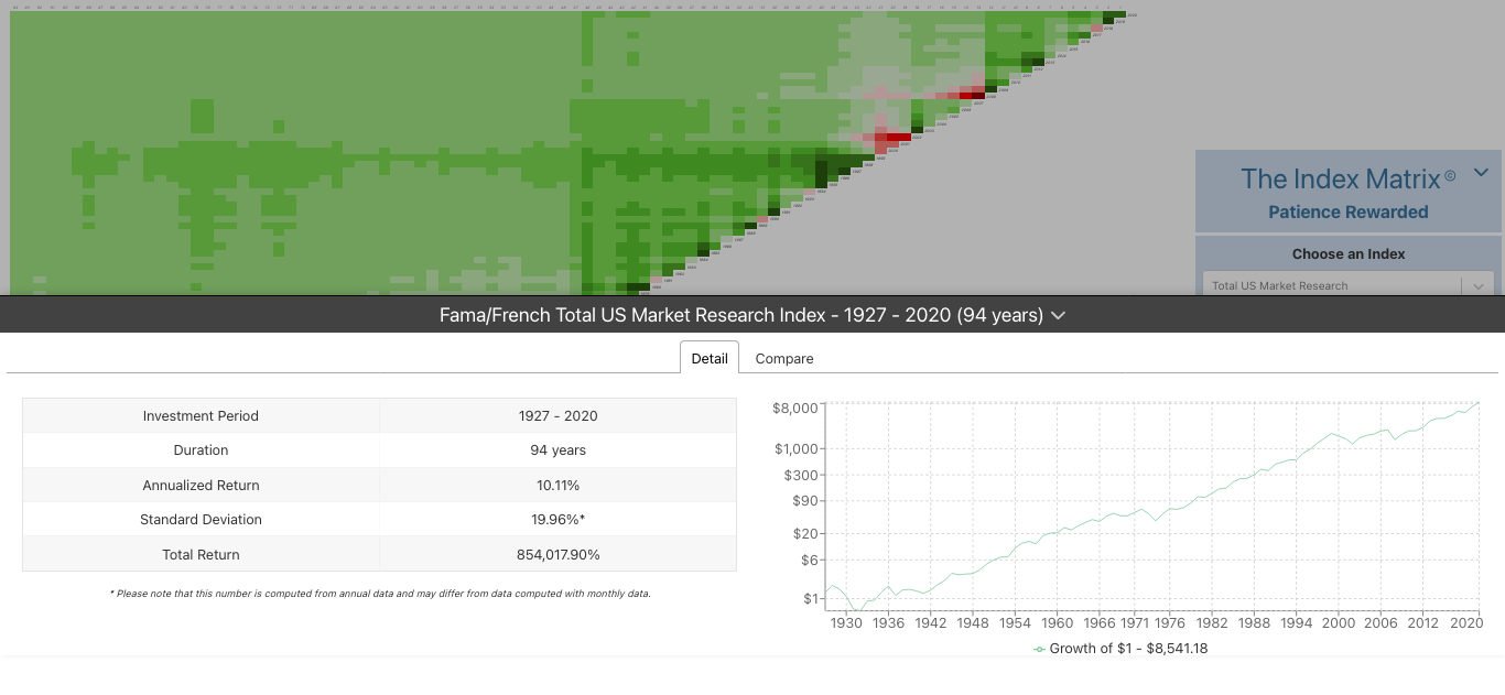
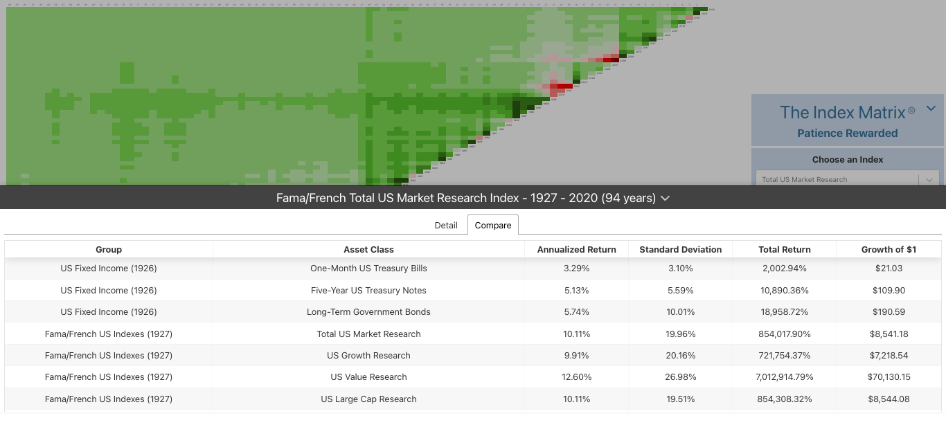
The Index Matrix App’s heatmap visualization helps advisors direct their clients’ focus away from solely numbers to more impactful long-term trends.
The index returns are show in shades of green (positive) and red (negative), with the highest highs shaded in deep green and the lowest lows shaded in deep red. We refer to the diagonal (year-to-year returns) as the “barbed-wire fence of investing.”
This helps financial advisors communicate to clients that if they can persevere through the tough times in the market, they’ll have the opportunity to enjoy the “greener pastures” the stock market has to offer over time.