The Index Matrix App

Powerful perspective. Better investment decisions.

A unique and captivating view of market risk for long-term investors

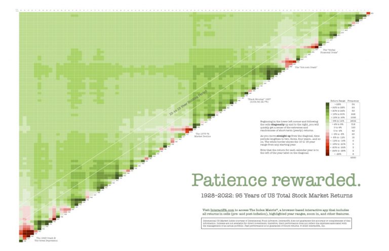
The Index Matrix is a browser-based app that displays the historical returns for 23 US and non-US stock and bond indexes using a visually powerful heat-mapping technique.

From any starting year (on the diagonal), investors can view yearly outcomes from 1927 to 2022 and annualized returns (up from the diagonal) for longer periods up to 96 years. Heat mapping of return ranges offers a big picture view of the “green pastures” the US stock market offers to patient investors who can get beyond the “barbed wire” of short-term volatility.

An annual subscription includes free PDF downloads to print 24″ x 36″ wall posters and 8.5″ x 11″ handouts–especially powerful educational tools for next generation investors and advisors.

App Features

Select Index

Choose one of 23 indexes from the pulldown menu.

Keep Returns Off

Create a more powerful visual without the clutter of returns.

Turn Returns On

Get deeper in the weeds by showing the returns in the cells.

Show After Inflation

Most useful with the fixed-income indexes.

Choose Timeframe

Choose a specific year range with returns on or off.

Highlight Year Range

Show 1-5, 6-10, or 11-15 year range across all starting years to show benefit of patience.

Show Details

Review the metrics for the index for a year range.

Compare

Show returns for all indexes and sort by annual return and risk.

Posters & Handouts

Total US Stock Market Matrix

The poster is based on the Dimensional US Market Index matrix from 1928-2022. It does not include returns in the cells. Important market declines are shown along with a return range key.

US Small Value Stock Matrix

The poster is based on the Dimensional US Small Cap Value Index matrix from 1928-2022. It does not include returns in the cells. Important market declines are shown along with a return range key.

Yearly Returns Are Random (boxes)

For the period 1995 to 2022, this poster shows a set of core asset classes ranked from highest return to lowest return each year. It’s purpose is to illustrate the randomness of asset class leadership year-to-year and the folly of under- or over-weighting asset classes based on predictions of future performance.

Yearly Returns Are Random (lines)

This poster tracks the yearly changes in rank for the asset classes and includes an asset class mix for comparison of volatility.

The History of Market Ups and Downs

This poster shows US market history in a different perspective from the matrix posters. Using monthly data, an up market is defined as a sustained rise in stock prices prior to a 20% or more decline. A down market ends after a 20% gain in the market. The duration and degree of each cycle is displayed along with a “growth of $1” line.

Benefit from over 90 years of stock market history

Our tool’s heat map visualization helps investors and financial advisors direct focus away from over 4,500 return numbers (US indexes) to more powerful and relevant long-term trends.

Train your advisory team

Market history isn’t typically taught in Certified Financial Planner™ courses. Use our app to prep next-gen advisors for client interactions.

Mitigate clients’ market anxiety

It’s not enough to tell yourself or your clients “this has happened before.” With The Index Matrix app and printed images (posters and handouts), you can actually show them.